Hey Lovely Entrepreneurs! 🌟
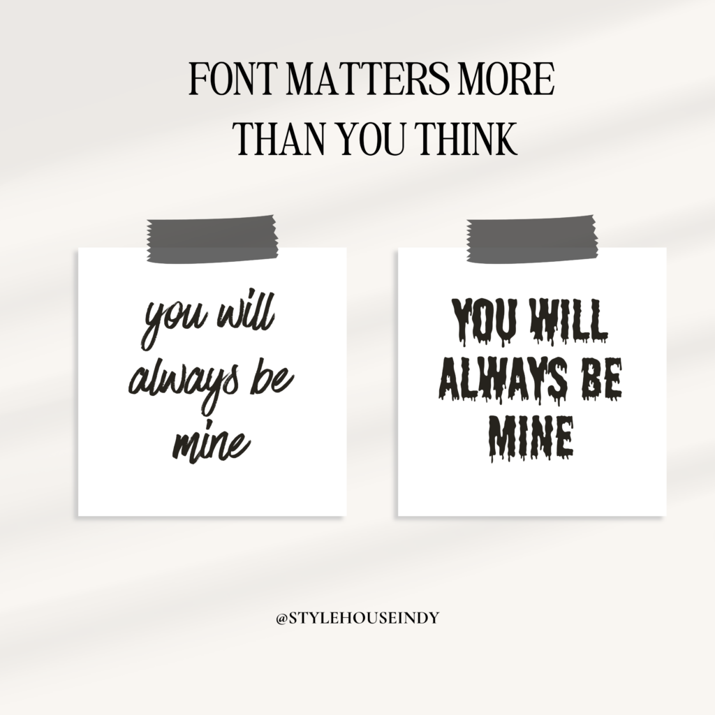
Have you ever thought about the impact of the fonts you use for your brand? The world of typography is more powerful than you might imagine! The right brand fonts and text design can elevate your visual identity and create a memorable brand experience. Let’s dive into the magic of design elements and see how they can transform your branding game! 🚀
The Power of Typography in Branding
Typography isn’t just about making your text look pretty. It’s a crucial part of your brand’s personality and can significantly influence how your audience perceives your business.
Here’s why typography is a big deal:
First Impressions Count: Your font choices can create an immediate impression. Whether it’s professional, playful, luxurious, or approachable, your typography sets the tone.
Consistency Builds Trust: Consistent use of typography across all platforms helps build brand recognition and trust.
Readability Matters: Clear, readable fonts ensure your message is easily understood, making your content more engaging.
Choosing the Right Brand Fonts
When it comes to selecting your brand fonts, consider the following tips:
Know Your Brand Personality: Your fonts should reflect your brand’s personality. Are you elegant and sophisticated? Fun and quirky? Professional and reliable? Choose fonts that match your vibe.
Limit Your Font Choices: Stick to two or three fonts to keep your design cohesive. Typically, this includes a primary font for headers, a secondary font for body text, and an accent font for special elements.
Consider Your Audience: Make sure your fonts resonate with your target audience. What appeals to them? What’s easy for them to read?
The Impact of Text Design on Visual Identity
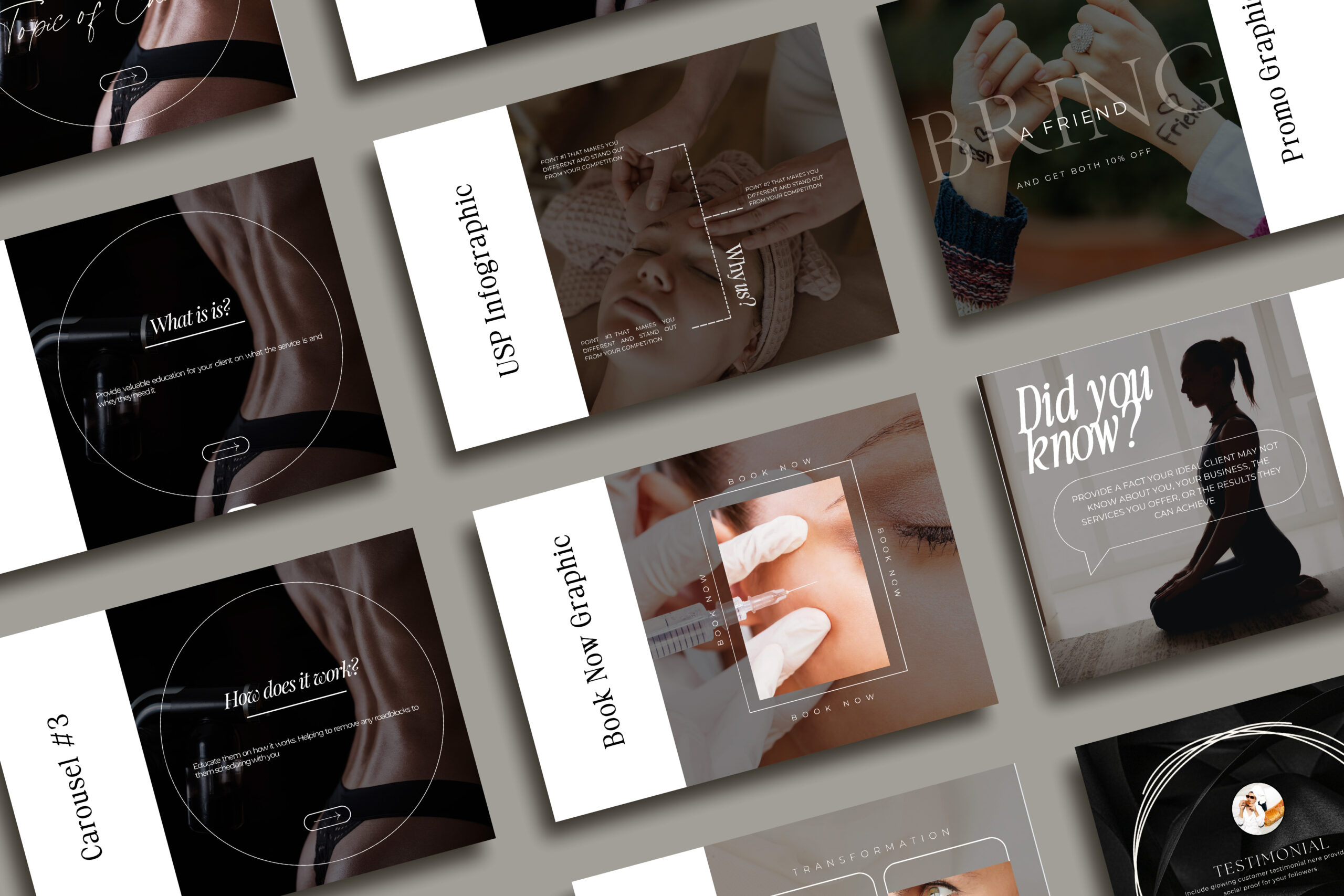
Text design is all about how you arrange your fonts to create a cohesive and appealing visual identity.
Here are some tips to get it right:
Hierarchy and Structure: Use different font sizes and weights to create a clear hierarchy. This helps guide the reader’s eye through your content.
Spacing is Key: Pay attention to letter spacing (kerning) and line spacing (leading) to improve readability and aesthetics.
Alignment and Balance: Proper alignment and balance make your text look neat and professional. Left-aligned text is generally easiest to read.
Typography and Emotional Connection
Believe it or not, fonts can evoke emotions!
Here’s how different types of fonts can make your audience feel:
Serif Fonts: Traditional, reliable, and formal. Great for businesses that want to appear established and trustworthy.
Sans-Serif Fonts: Modern, clean, and straightforward. Ideal for a minimalist and contemporary look.
Script Fonts: Elegant, sophisticated, and personal. Perfect for brands that want to add a touch of luxury or creativity.
Display Fonts: Bold, distinctive, and attention-grabbing. Use sparingly for special elements to make a statement.
Ready to Transform Your Brand with Typography? 🖋️✨
If you’re excited to see how the right typography can elevate your brand, let’s chat! I’m here to help you choose and design the perfect fonts that align with your brand’s personality and goals.
Let’s make your text pop and your brand unforgettable! ✨🖋️
Stay Fabulous. Keep it stylish, keep it fab, and watch your business grow! 💼✨
P.S. Found these tips helpful? Imagine what we can achieve together! Book a free consultation HERE and let’s start creating a visually stunning brand that speaks to your audience! 🌟
🤑Want to get awesome tips and tricks like this in your inbox each week? Head HERE to sign up!🤑
think we might be a fit?
Let’S TELl Great STories
Ready to start creating a vibrant, captivating brand... or just have me to do it for you? Let's get started.


+ Show / Hide Comments
Share to: